
Design system
Private reference — noindex. Live render of every active token in src/styles/variables.css plus every reusable component on the site, fed by real post entries.
Article hero
Three variants of src/components/sections/Hero.astro — real component renders, fed by live post entries. The same component handles all three via variant + category.
Featured (homepage) — review featured post
Tungt, i aluminium, og en fryd å skrive på
Corsair MAKR PRO 75 er et tungt Hall Effect-tastatur i heldekkende aluminium med hot-swap magnetbrytere, en knob, og det støtter både Corsair WebHub og iCUE.
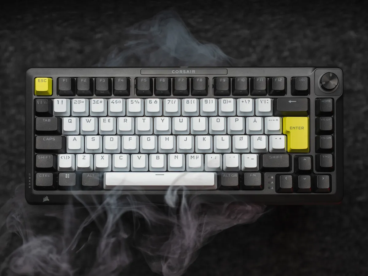
Prop: variant="featured". Used by src/pages/index.astro for the lead post. Text-left + image-right grid, pills overlap the image top edge, the headline is a stretched link covering the whole block. Because this featured post is a review, it also picks up the .is-review treatment (radial mint glow + heavier grain).
Article — news style
AM5 lever til 2029, og 7700X3D lanseres snart
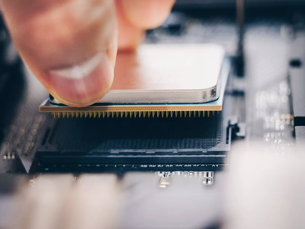
To deilige AMD-nyheter (foreløpig) fra Computex 2026: AMD forlenger den offisielle støtten for AM5-plattformen heeeeelt til 2029, og lanserer samtidig Ryzen 7 7700X3D med 8 kjerner, 16 tråder, 120 W TDP og 104 MB cache. Salgsstart internasjonalt 16. juli, for 329$. Norsk pris ukjent.
Prop: variant="article" with category in news, video, portfolio, quick-look. Internal flag isNewsArticle triggers the flipped grid (image left, meta right). Full-width title + eyebrow render above the 2-col layout.
Article — review style
Tungt, i aluminium, og en fryd å skrive på
Corsair MAKR PRO 75 er et tungt Hall Effect-tastatur i heldekkende aluminium med hot-swap magnetbrytere, en knob, og det støtter både Corsair WebHub og iCUE.
Prop: variant="article" with category in review or interview. Adds .is-review which paints a radial-gradient glow and a grain overlay at var(--grain-opacity-hero) with mix-blend-mode: overlay. Rating badge anchors top-left of the image.
Rating dice (terningkast)
Reviews score on a 1–6 dice scale (Norwegian terningkast convention). The hero badge keeps its mint→white gradient square; the inner content is an SVG die from src/components/ui/Dice.astro. Pip colour comes from the article's pre-computed accent via getArticleAccent(slug) so each review's die echoes its hero image.
Die SVG fills a 1:1 container. Pips fixed at cx,cy on a 3×3 grid in a 0 0 24 24 viewBox. The face value determines pip layout per the standard die convention; color sets fill on each <circle>. A 6/6 (terningkast 6) is reserved for exceptional verdicts.
Badge shadow is intentionally tighter, darker and higher-opacity than a typical elevation shadow so it reads on the dark hero background — no glow, editorial not app-like. Applied via filter: drop-shadow() using these overridable tokens: --die-shadow-x (0), --die-shadow-y (4), --die-shadow-blur (12), --die-shadow-opacity (0.45), --die-shadow-color (0 0 0, RGB triplet). On article heroes the badge plays a once-per-load die-settle entrance (450ms rotate/scale overshoot, Hero.astro) — transform-only, skipped under prefers-reduced-motion.
On review cards, the same dice appears bottom-right of the image at 32px, translated 50% downward so half overlaps the image and half drops into the content area. Hidden on the compact variants (card--latest, card--mobile-compact) where badges are already suppressed.
On hover, the card and hero dice reveal a localized one-line tooltip explaining the value (e.g. a 6 is "a product I love and would buy"). Source strings live in src/lib/i18n.ts as rating_meaning_1…rating_meaning_6 (EN + NO), read via the ratingMeaning() helper; the shared bubble style is .die-tooltip in global.css. CSS-only, no JS. The badge takes pointer-events: auto so hover fires, but the die stays inside the card link so a click still opens the article; the tooltip itself is pointer-events: none. Meaning is also folded into the die's aria-label for assistive tech.
Cards
Real <Card> renders (src/components/ui/Card.astro) fed by live post entries. Standard, top-pick, and quick-look variants.
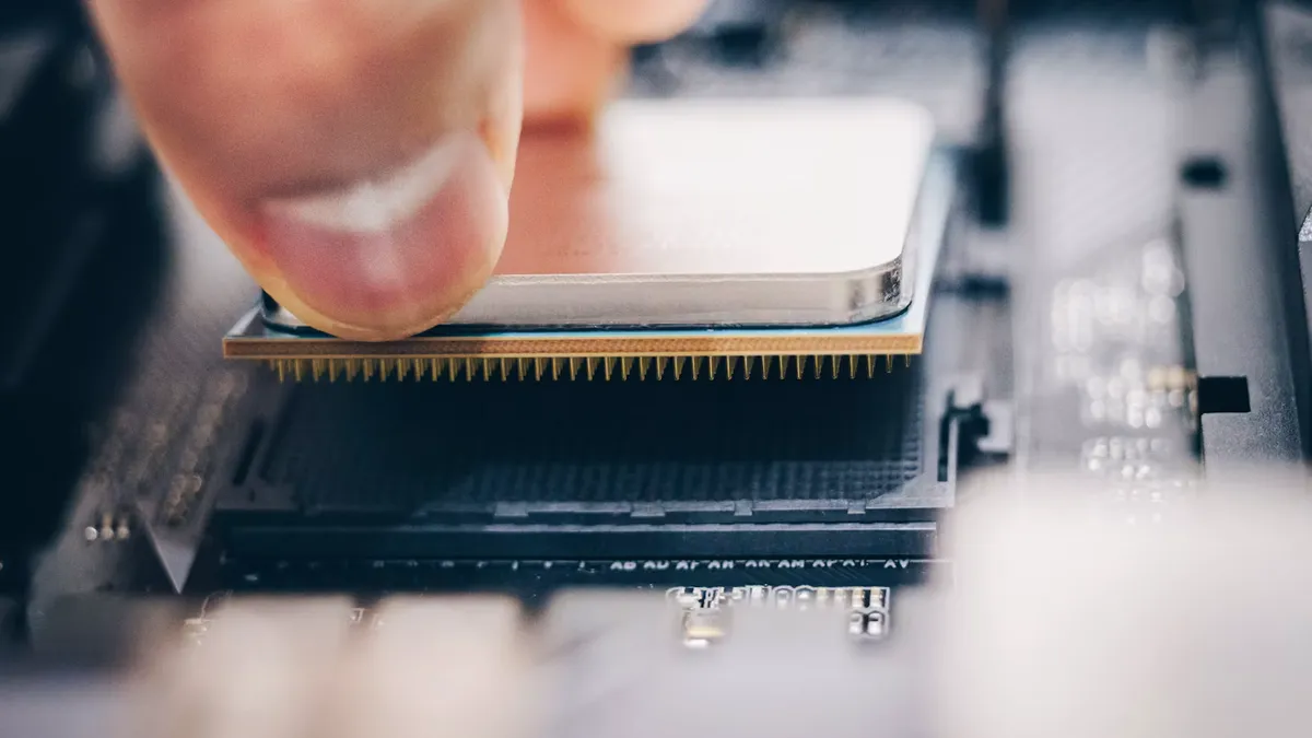
AMD supporterer AM5 helt til 2029, og slipper samtidig Ryzen 7 7700X3D
To deilige AMD-nyheter (foreløpig) fra Computex 2026: AMD forlenger den offisielle støtten for AM5-plattformen heeeeelt til 2029, og lanserer samtidig Ryzen 7 7700X3D med 8 kjerner, 16 tråder, 120 W TDP og 104 MB cache. Salgsstart internasjonalt 16. juli, for 329$. Norsk pris ukjent.
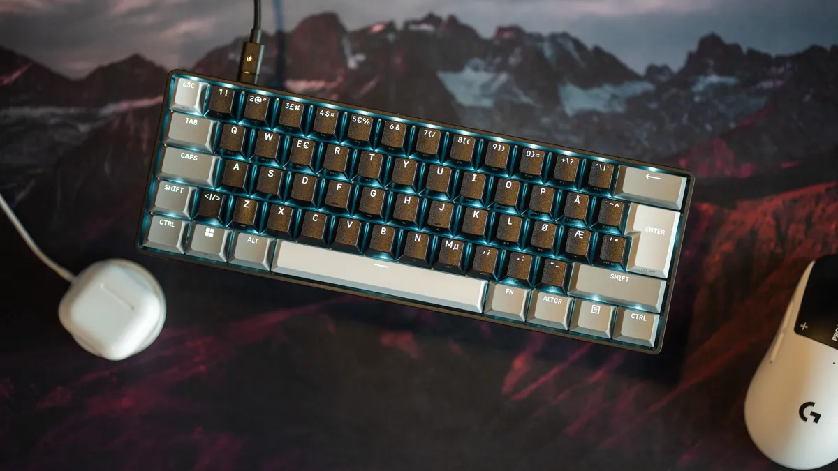
Corsair Clipper Pro Mini 60: overraskende mye for pengene
Corsair Clipper Pro Mini 60 er et lite 60% keyboard med Hall Effect, justerbare brytere, og som tåler støv og vann. Lett med sine 415 gram, men jeg synes det er mye tastatur for 1095 kroner.
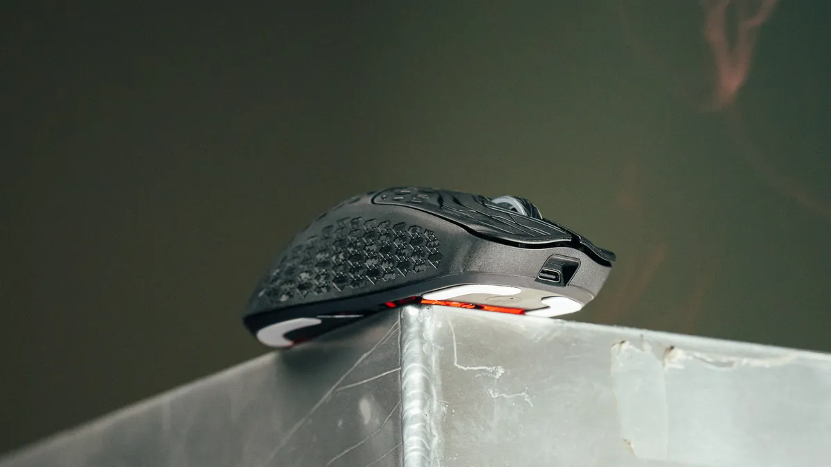
Keychron G5 hurtigtest
Keychron G5 veier 45,6 gram, kjennes utrolig deilig ut, og kommer med adaptere til alt. Førsteinntrykket er veldig positivt.
Pills are absolutely positioned and sit -10px above the image edge so they overlap. Title gradient uses linear-gradient(19deg, --color-text 0%, --color-accent 60%) text-clip. Hover lifts and tilts the whole card in 3D (translateY(-6px) rotateX(4deg) rotateY(-3deg)), bumps image saturation/brightness, and floats tag pills forward (translateZ(14px)) ahead of the title (translateZ(10px)). Disabled under prefers-reduced-motion: reduce.
Size variants
Cards default to a vertical layout. The homepage grid (HomepageGrid.astro) passes a size prop that scales the title/description and, for latest, switches the whole card to a horizontal thumb + headline row.
default— the standard vertical card above. Used on hubs and the/news,/reviewindexes.feature— vertical, slightly smaller title. The homepage trio/stack default.hero/spotlight/strip— vertical, progressively larger title; for the big homepage slots (8-col hero, 8-col banner, 12-col panoramic).latest— horizontal: square thumb left with an accent-colored right border, headline right. Description, date, overlay pills and the 3D tilt are all dropped. This is the homepage LATEST / SISTE ticker. Live render below.
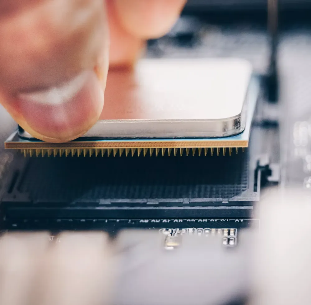
Mobile-compact rule (homepage news)
A mobile-only behavior, not a separate component — it reuses the horizontal anatomy of latest above.
The rule: on the homepage at max-width: 719px, after the first two big cards in document order, every news-category card collapses to the compact horizontal row (square thumb, accent line, headline). It keeps the News / Nyheter kicker rather than the LATEST label, and hides the description, date and overlay pills. HomepageGrid.astro walks the resolved layout, counts big cards (anything that isn’t the latest strip), and sets mobileCompact on qualifying news cards; Card.astro turns that into .card--mobile-compact, which only does anything below 720px. Desktop (≥720px) is unaffected — the same cards stay full vertical cards. Purpose: shorten the mobile scroll and break the wall-of-big-cards rhythm without changing what’s shown. Item count is identical; only the height of those news cards changes.
Homepage grid — what’s shown on the front page
The front page is data-driven from one file: src/content/homepage.ts. Edit that file to change what appears — no component changes needed. It is a list of rows; each row holds cells whose span values sum to 12 (a 12-column grid). homepageResolver.ts turns the config into resolved posts, then HomepageGrid.astro renders them.
Cell types
{ type: 'card', span, content }— a single post card. Optionalsize(featuredefault),aspect(16:9default),showDescription.{ type: 'stack', span, items: [...] }— a vertical column of cards in one cell; each item takes its owncontent+ optionalsize/aspect/showDescription.{ type: 'news_list', span, content: { rule } }— the text-only news list (no images). The cheapest way to surface many items.
Content sources — how a slot is filled
- Pin a specific post:
content: { pin: 'the-slug', fallback?: 'showcase' | 'news' | 'any' }. If the slug isn’t found, thefallbackchain fills the slot so the grid never renders a hole. Cross-language pins resolve viatranslationSlug. - Auto-fill by rule:
content: { rule, count?, minDays?, maxDays? }whereruleisnewest_news,older_news(windowed byminDays/maxDays), ornewest_any. Rules pull live from the collection, newest first.
A post is reserved the moment it’s placed, so the same article can never appear twice across the page — pins, rules and the news list all dedupe against each other automatically. To add items: append a row, add a card to a stack, or raise a news_list count. To resize: change span values (keep each row summing to 12). To swap a feature: change a cell’s pin slug.
Current layout (mobile order = top to bottom)
- Row 1 —
latestticker (newest post, any category) - Row 2 — hero (8) + stack (4): pinned showcase + newest news
- Row 3 — stack (4): two newest news + spotlight (8): pinned review
- Row 4 — trio (4·4·4): news · pinned review · news
- Row 5 — spotlight (8): pinned +
news_list(4): older news - Row 6 — panoramic
strip(12): pinned
On mobile every cell stacks full-width in this order, and the mobile-compact rule (see Cards above) collapses news cards past the first two big ones. On desktop the spans take over at ≥720px. Source: src/content/homepage.ts, src/lib/homepageResolver.ts, src/components/sections/HomepageGrid.astro.
Content components
Real renders of every MDX-usable component that appears in posts.
UrlLink (preferred) / ReadMyReview (legacy)
Link-card primitive used across 46 posts. Auto-detects internal vs external URLs — internal pulls the linked post's title + heroImage, external fetches OG image + title at build time. <UrlLink> is a thin alias around <ReadMyReview> with a neutral default label="Read more". Use <UrlLink> in new posts; existing posts keep using <ReadMyReview> unchanged.
Source: src/components/UrlLink.astro (wrapper) → src/components/ReadMyReview.astro (implementation). MDX usage in new posts: <UrlLink url="/review/the-slug" /> or <UrlLink url="https://example.com" label="Read the source" />.
ProsAndCons
Two-column block fed by an exported reviewProsCons object in the post’s MDX.
- Lightweight 56 g chassis with a familiar ergonomic shape
- 8000 Hz polling rate over wireless, no dongle compromises
- Solid 100-hour battery life at 1000 Hz
- Side buttons remain on the small side
- No DPI indicator on the body
Source: src/components/ProsAndCons.astro. MDX pattern: export const reviewProsCons = { pros, cons } + <ProsAndCons /> picks it up via the export.
Gallery
Multi-image grid used across 30+ reviews and news posts. Each image opens in the lazy-loaded GLightbox modal.
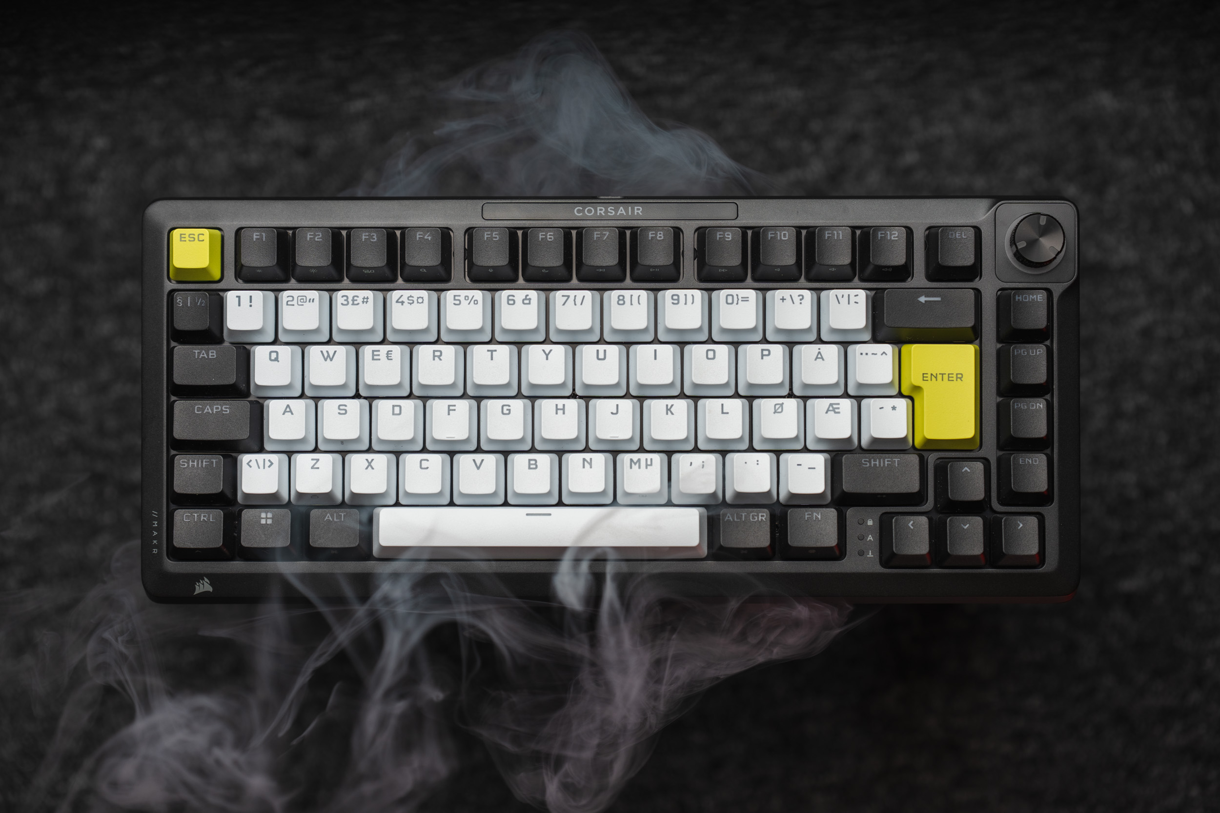
Square 3-up variant via columns={3} + square (forces a 1:1 crop with object-fit: cover).
Source: src/components/Gallery.astro. MDX: <Gallery images={[image1, image2]} /> where each image is imported at the top of the file. Optional props: columns (grid columns) and square (1:1 crop).
SourceLine
End-of-article source credit. Mono uppercase Kilde/Kilder eyebrow (from i18n) above a hairline rule, with muted links that go accent on hover. Replaces the ad-hoc --- + italic *Kilde: …* pattern.
Source: src/components/SourceLine.astro. MDX: <SourceLine sources={[{ label, url }]} />. Optional label prop overrides the eyebrow; default is singular/plural by source count.
YouTube embed
From astro-embed. MDX: import { YouTube } from 'astro-embed'; then <YouTube id="VIDEO_ID" />.
Inline image + caption
Standard markdown image followed by an italic line — Markdown renders the italic as <em>, which the global stylesheet styles as a caption.

Caption sits directly under the image. IBM Plex Mono, --caption-font-size, #cccccc.
MDX pattern:  on its own line followed by *caption*. Article images are automatically wrapped by <Lightbox /> for click-to-zoom.
Image callout (figure beside text)
For a small image (e.g. a Steam store card) that would look upscaled at full content width. It sits at a fixed card width (340px) on the left with its credit caption directly beneath it (same width, wraps when longer), beside a vertically centered text panel. The prose uses Syne at default weight, slightly larger, with a first-line indent. Stacks on narrow screens; the image opts out of the full-width .post-content img rule.
Global class in global.css. MDX: inside <figure class="figure-callout"> put a <div class="figure-callout__media"> wrapping the markdown  (blank lines around it) plus a .figure-callout__credit caption span below it, then a <figcaption class="figure-callout__caption"> holding the .figure-callout__text prose.
Lightbox
Source: src/components/Lightbox.astro. No props — drop the component into a layout and it script-wraps every article img (excluding gallery images and .no-lightbox). GLightbox CSS + JS are lazy-loaded on first click. Already mounted on every article page via PageComponent.astro.
ToC (Table of Contents)
Source: src/components/ToC.astro. The sidebar to the right of this page is a live render — it scanned every h2/h3 inside [data-article-content] on this page and built itself. Opt-in per post via toc: true frontmatter; mobile gets a FAB-triggered drawer.
AudioPlayer
Accent-ring play/pause control over a native <audio> element, with a label and a live MM:SS readout. Two uses: (1) inline in review MDX for sound tests, and (2) the :focus-visible + compact hero-meta variant used by the text-to-speech “Hear summary” trial — when a post sets audioSummary frontmatter, Hero.astro renders a 30px-button version beside the date / reading time.
Default (inline / sound-test):
Compact hero-meta variant (“Hear summary”):
Source: src/components/AudioPlayer.astro (styles in global.css). MDX inline: import AudioPlayer from '@components/AudioPlayer.astro' + <AudioPlayer src={mp3} label="…" />. TTS variant: set audioSummary: "/audio/<date>-<slug>-<lang>.mp3" in frontmatter; audio is generated offline via npm run tts (scripts/generate-tts.mjs).
Pills, chips & tags
.category — solid mint chip, uppercase, var(--text-xs). Used in article headers and post metadata.
.tag — mint text, no background, var(--text-sm). Used as #tag chips in the post-tags row at the bottom of every article. Cards use a separate .card-tag class.
.hero-badge — overlay pills anchored to the hero image (Hero.astro, featured variant). .featured uses --color-variation-4 (pink); the second pill uses --color-accent-tertiary for the first post tag.
.hero-badge-pill — mint accent pill on review/interview hero images. Used for the REVIEW tag and the TOP PICK marker.
.card-tag — overlay pill anchored top-left of card images. Smaller (0.625rem) than hero badges, same purple --color-accent-tertiary. One pill per post tag, capped via maxTags.
.top-pick-badge is anchored top-right of card images, opposite the .card-tag stack. .quick-look-badge sits bottom-right, overlapping the image edge in the same slot the review dice (.card-rating) would occupy — a quick look has no rating, so the spot is free.
.nga-award-tag (Nordic Game Awards) — flat ceremony pills in the amber palette. Default is black fill with a 1px amber outline + amber text; the single Game of the Year tag inverts via .nga-award-tag--goty (amber fill, dark text). Shared by the awards page and the homepage highlight segment.
Editorial headlines (Syne)
Default <h1>–<h6> use system-ui bold + accent color. Syne is opted into selectively via .hero-title / .card-title. Bold-word emphasis inside heroHeadline uses Syne 700 with the heading gradient.
Hero title — Syne 500, with **word** emphasis → Syne 700 gradient
Why the Keychron M4 is the mouse I actually keep using
.hero-title var(--font-display), 500, var(--text-h1) Used on review and news hero blocks. Markdown-style **word** in heroHeadline frontmatter becomes <strong> rendered at 700 with the heading gradient applied to that word.
Card title — Syne 500, h3 scale
Razer Pro Type Ergo quick look
.card-title var(--font-display), 500, var(--text-h3) Used on every <Card> across grids: ContentGrid, TopicSection, UpcomingSection.
Hero summary — Syne 400, 1.26rem, letter-spacing 0.04em
A short editorial summary sits below the hero title. Looser tracking and lighter weight keep it from competing with the headline.
.hero-summary p var(--font-display), 400, 1.26rem Hero summary paragraph (src/components/sections/Hero.astro).
Project series divider — mono 600, mint rule with off-center name
DIY Steam Machine
.project-series-divider var(--font-mono), 600, var(--text-sm), mint rule Series anchor (grouped by projectName) on the /projects index (src/components/sections/ProjectSeriesDivider.astro). Name parks at the left third: short leading rule, long trailing rule. Reuses --color-accent + the eyebrow type stack — no new tokens.
Type scale — headings (defaults)
These are the global defaults: system-ui, bold, accent color. Component-level overrides (above) opt into Syne.
Heading 1 — page titles
Heading 2 — section headings
Heading 3 — subsections
Heading 4
Heading 5
Type scale — body
Large lead text used for intros.
Medium body text.
Default body copy size.
Small text for meta and labels.
Extra small text.
Caption text under images.
Font families
--font-display The quick brown fox jumps over the lazy dog 0123456789
Syne Variable — h1–h6, brand display
body (system-ui) The quick brown fox jumps over the lazy dog 0123456789
system-ui stack — paragraphs, default body
--font-mono The quick brown fox jumps over the lazy dog 0123456789
IBM Plex Mono — captions, code, tags, token labels
Font weights
The quick brown fox
The quick brown fox
The quick brown fox
The quick brown fox
Line heights
Lorem ipsum dolor sit amet, consectetur adipiscing elit. Sed do eiusmod tempor incididunt ut labore et dolore magna aliqua. Ut enim ad minim veniam.
--line-height-tight 1.2 Headings
Lorem ipsum dolor sit amet, consectetur adipiscing elit. Sed do eiusmod tempor incididunt ut labore et dolore magna aliqua. Ut enim ad minim veniam.
--line-height-normal 1.5 Default text
Lorem ipsum dolor sit amet, consectetur adipiscing elit. Sed do eiusmod tempor incididunt ut labore et dolore magna aliqua. Ut enim ad minim veniam.
--line-height-relaxed 1.6 Long-form prose, paragraphs
Colors
Backgrounds
--color-bg #111111 Body background everywhere
--color-bg-elevated #1a1a1a Elevated surfaces: dropdowns, ToC drawer, modal sheets
--color-bg-subtle #151515 Subtle alt sections (rarely), card background
--color-surface #1a1a1a Inline code + pre blocks in prose (same plane as elevated)
Text
--color-text #f5f5f5 Primary body text, headlines on light contexts
--color-text-muted #c8c8c8 Paragraph body across about, posts, descriptions
--color-text-subtle #707070 Meta info, timestamps, tertiary labels
Accents
--color-accent #99FFCC Brand mint — headings, links, tags, category chips, hover underlines, ::selection
--color-accent-rgb 153, 255, 204 RGB twin of --color-accent for rgba() glows (hero glow, ToC FAB, menu ambients) — edit together with the accent
--color-accent-alt #ff006e Hot pink — secondary accent (rare highlights)
--color-accent-tertiary #4800fb Purple — card tag pills, tertiary accent
--color-accent-hover #7fddbb Muted mint — hover state on accent elements
--color-variation-4 #cc33cc Magenta variation (decorative)
Borders
--color-border rgba(255,255,255,0.1) Card edges, hr, section dividers
--color-border-subtle rgba(255,255,255,0.05) Faint internal separators
NGA amber
--nga-amber #FFB340 Core ceremony amber — Nordic Game Awards page + homepage highlight (titles, pills, winner borders)
--nga-amber-bright #FFCD78 Lighter step — hovers, mid gradient stops
--nga-amber-hi #FFE9C2 Warm specular highlight (near-cream)
--nga-amber-deep #C77A14 Deep metallic mid-tone
--nga-amber-shadow #3a2408 Darkest stop in the spinning winner-border ramps
Gradient
Other components
Default link with mint underline
inline code Inline <code>
"A blockquote of decent length to show the styling treatment."
<blockquote> in articles
Card accent symbols
A single coloured glyph in the bottom-right of each card, tinted with a dominant colour extracted from the post’s heroImage. Quiet per-post flourish that picks up the image palette.
Source: src/lib/cardAccent.ts + scripts/extract-card-colors.mjs. Colours are pre-extracted at build time, keyed by slug in src/data/card-accents.json. Symbol is chosen deterministically per slug via FNV-1a hash mod pool length. Roughly 20% of cards skip the symbol entirely (also slug-deterministic) so the grid breathes.
Spacing scale
4px base unit. Bars are sized to each token.
--space-1 4px --space-2 8px --space-3 12px --space-4 16px --space-5 24px --space-6 32px --space-8 48px --space-10 64px --space-12 96px Radii
--radius-sm 4px Default subtle rounding — tag chips, code pills, swatches
--radius-md 8px Card-shaped surfaces — family blocks, lh-block, shadow-card
--radius-full 9999px Circular buttons — ToC FAB, search button
Shadows
--shadow-lg Cards, prominent surfaces
--shadow-tag Tag chips
Transitions
Hover the buttons to feel the difference.
Film grain
--grain-opacity: 0.08 Layered over backgrounds site-wide for analogue texture.
Hero treatment
--grain-opacity-hero: 0.18 Heavier grain scoped to review and interview hero sections via the .hero.is-review modifier — layered over a radial mint glow.
--hero-glow-color: rgba(var(--color-accent-rgb), 0.18), 500px radius Radial gradient fading from this color in the bottom-right corner of .hero.is-review to transparent at 60%.
Interview Q&A
Four components for the interview template. Authors write <Q>, <A>, <PullQuote attribution="…"> and <Note>. Questions are marked by a large Syne ?; answers render as plain aligned text. The Note label is i18n: Editor's note (EN) / Kommentar (NO).
Pull quotes sit between turns, not inside answers. Same mint top-bar treatment as standard article blockquotes.